
Our in-house artwork service is your first step toward achieving your company's graphic design vision. The finished print quality of a custom-made label is greatly impacted by the attention your artwork receives. From initial concept to a finished design we have the staff with the knowledge of advanced graphics and label printing processes to ensure the best possible results.
Douglas Storrie Artwork Guidelines
Artwork Resolution
All picture files included in designs should be supplied at a minimum resolution of 300dpi. Anything less than this is likely to result in poor print quality.
Acceptable Artwork
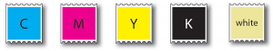
Unless it is wished to match a specific spot colour, artwork should be supplied converted to process colours (CMYK), and saved with the document’s colour mode as CMYK: RGB is for visual display only and imparts a misleading brightness to what is viewed on a computer screen, compared to what can be expected from a finished print job.
Acceptable file formats
Illustrator (.ai), .pdf, .eps, .tif and jpeg (though it should be noted that the latter tends to darken printed colours).
Photoshop (psd.) files should be converted into illustrator for a better print quality.
When saving final files for print all layers and transparency should be merged or printing results might vary from what can be seen on screen.
If spot colours are required, they should be set up and indicated on the design’s page by a colour tab (it should be noted if printing digitally; not all PANTONE spot colours can be rendered accurately by a digital process).
Similarly, special ink such as white and spot varnish should be given a visible colour and displayed accordingly.
Trapping/Grips
Where colours overlap or adjoin one another to counter any misregistration that can cause gaps between colours on the final output.
It is still a good idea for spot white or varnish areas to be under-cut/inset by .25mm (see below left).

Bleed
If colour(s) extend to the edge of a design they should be spread off its edge by at least 1.5mm (as shown above) to allow for slight variations in print and cutting out.
Fonts
All text should be converted to paths/outlines and embedded in the design or the font files provided with the design sent to us.
Barcodes
If you supply EAN barcodes they should comply with the rules of that organisation regarding size and proportions. Many large retailers insist on them being checked so that they can be assured that they will be viable at checkouts on sale of the goods. We will happily re-create an EAN to the “legal” specification if required. Other symbologies are not usually so critical, though it helps if a barcode isn’t too small!
For more information about our artwork services, please direct your questions to studio@storrielabels.com